Heretik - logo and branding
Heretik is a tech start-up that leverages machine learning to solve inefficiencies during legal contract review. Deeply integrated with leading e-Discovery platform Relativity, their software simplifies the import process, automates contract categorization, and identifies key contract sections to save legal teams valuable time & resources.
As a company, Heretik is defined as those who refuse to conform to established standards of conduct by seeking knowledge. They believe any challenge can be solved through the right mix of people and technology. They are passionate about connecting expert problem-solvers with the most important, thrilling, and profitable parts of their work.
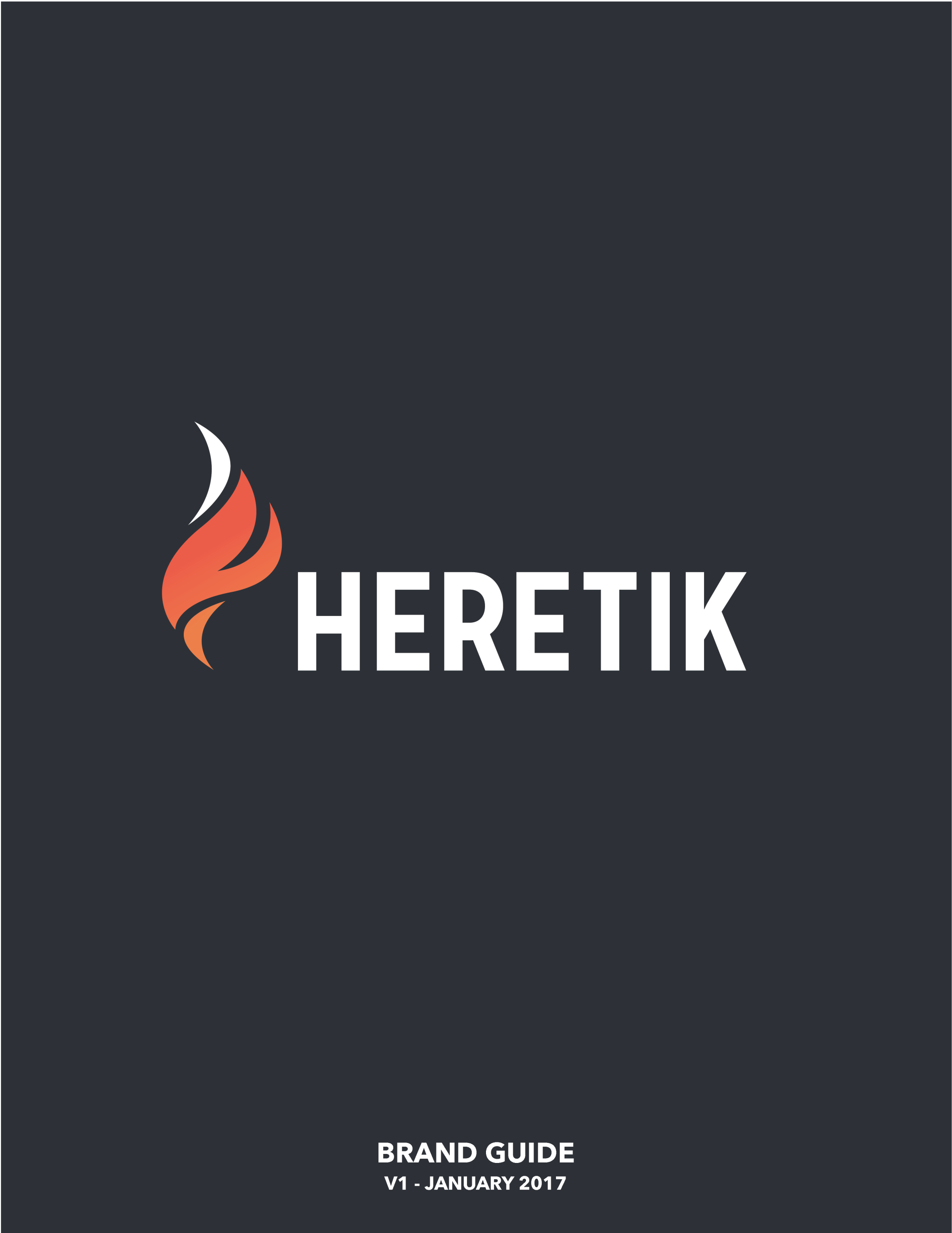
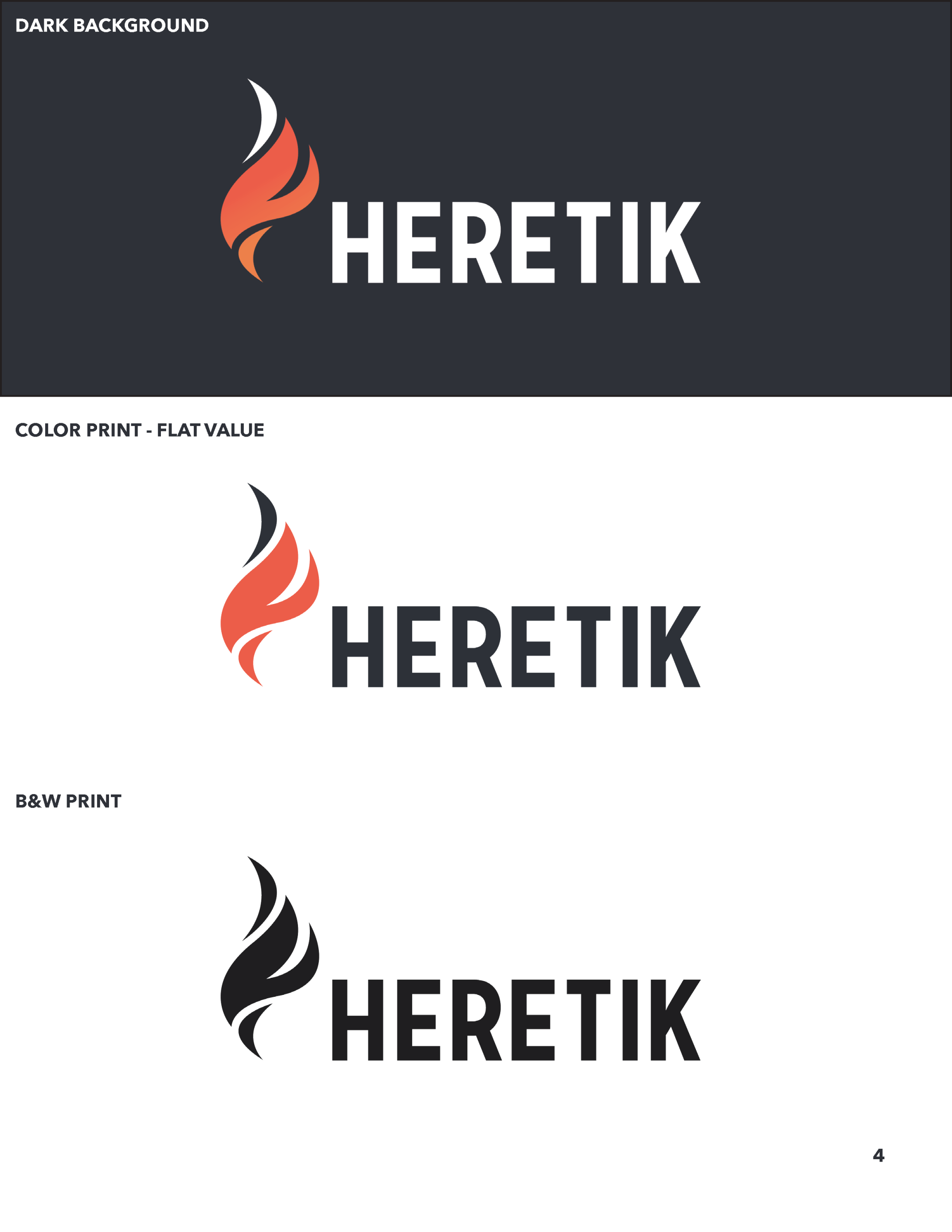
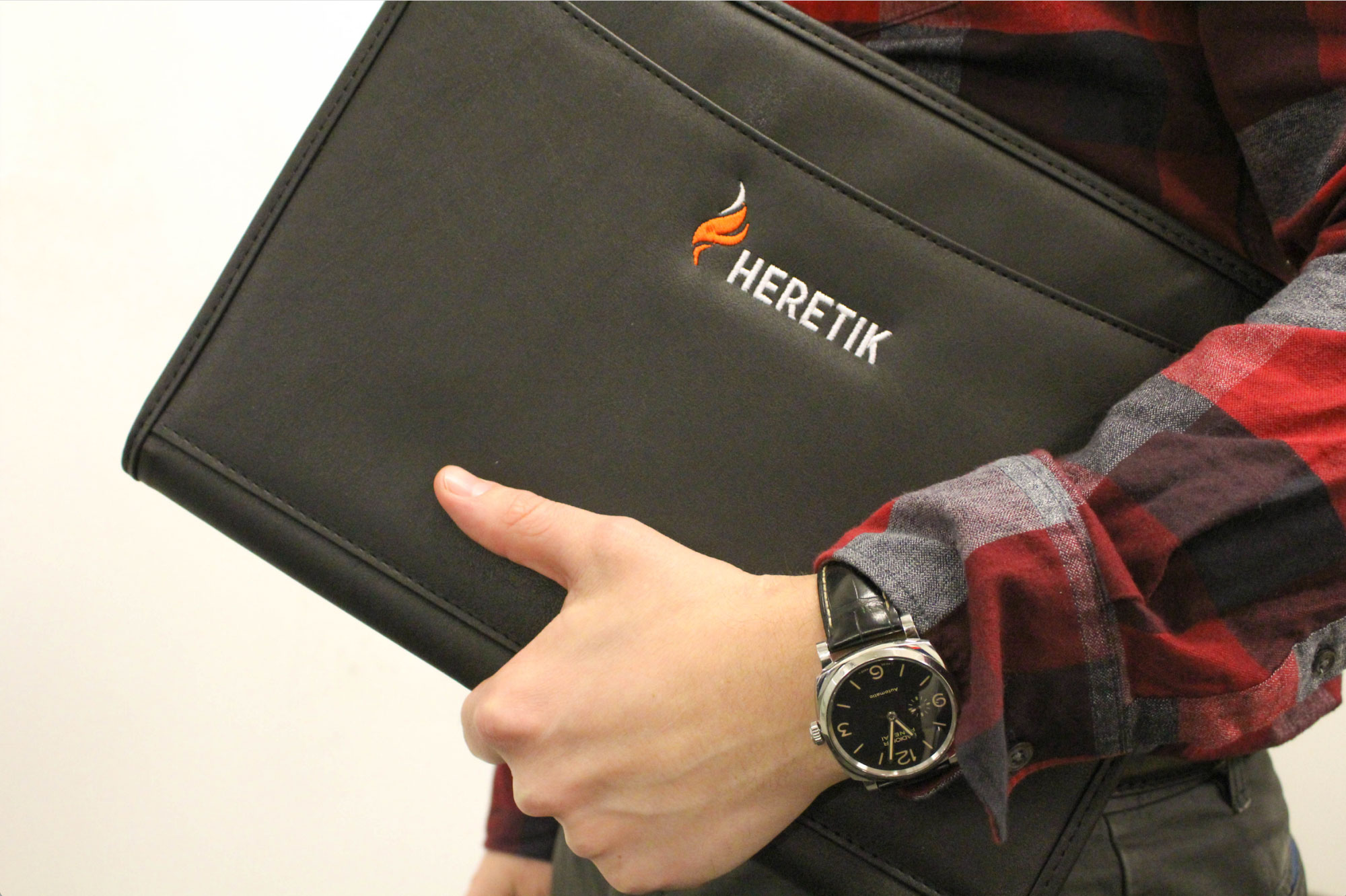
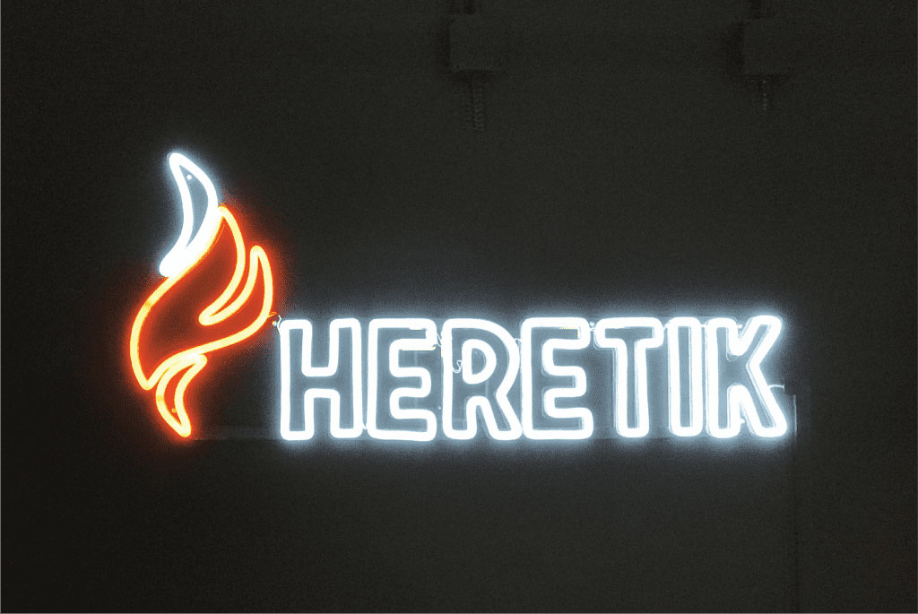
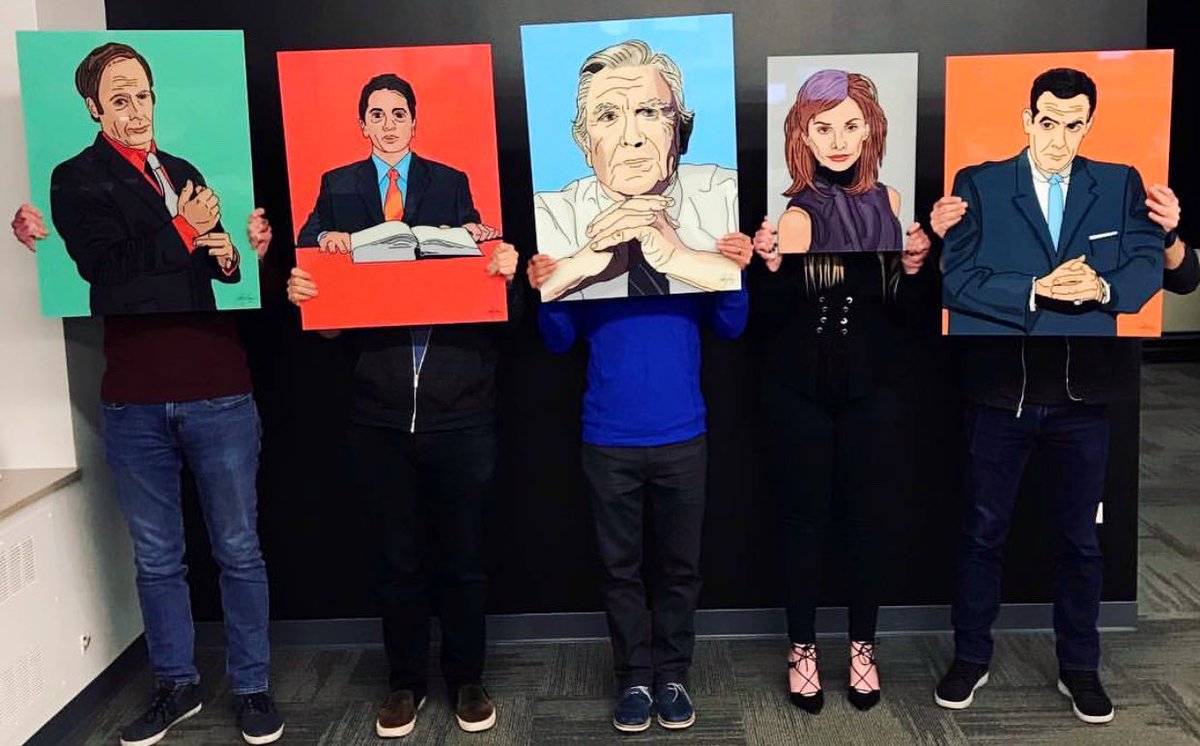
With these things in mind, I concepted, designed, and developed a logomark of a flame, signifying Heretik as a disrupter in the legal space, burning the old and starting anew. Also if you look closely the flame is also the letter ‘K’, a subtle nod to their mission. Additionally I illustrated portraits of famous lawers for the start-up’s office space.
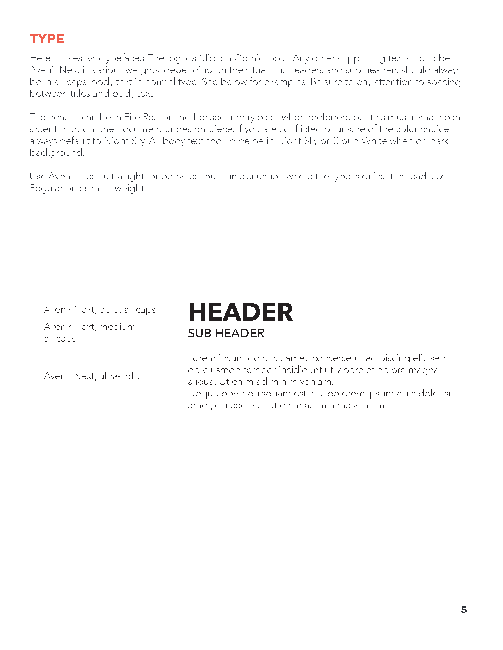
Heretik was the first branding experience I started and completed on my own and for that I am extremely grateful. Snippets of my original (and scrappy:) guide is below.
The Heretik brand has expanded and evolved throughout the years since I’ve been involved. View the evolved Heretik style guide here and see what they’ve been up to!
As a company, Heretik is defined as those who refuse to conform to established standards of conduct by seeking knowledge. They believe any challenge can be solved through the right mix of people and technology. They are passionate about connecting expert problem-solvers with the most important, thrilling, and profitable parts of their work.
With these things in mind, I concepted, designed, and developed a logomark of a flame, signifying Heretik as a disrupter in the legal space, burning the old and starting anew. Also if you look closely the flame is also the letter ‘K’, a subtle nod to their mission. Additionally I illustrated portraits of famous lawers for the start-up’s office space.
Heretik was the first branding experience I started and completed on my own and for that I am extremely grateful. Snippets of my original (and scrappy:) guide is below.
The Heretik brand has expanded and evolved throughout the years since I’ve been involved. View the evolved Heretik style guide here and see what they’ve been up to!


Preliminary Heretik Brand and Style Guide